Dept. of Municipal Vexillology
 I'm completely entranced by this rundown of municipal flags of U.S. cities. The website belongs to the North American Vexillological Association, vexillology being the study of flags, which I did not previously know. They published a book including all these images and more information, which sounds like it could be plausibly interesting.
I'm proud of Pittsburgh for having a decent city flag (above): many cities do not, as evidenced by this website.
Chicago has a pretty nice-looking city flag, one that was designed back in 1917 and seems to be gradually accumulating stars. The city flag of Wichita, KS (according to this marvelous little history) has an appealingly modern look, courtesy of a local artist who netted $85 of prize money for it in a 1937 contest, but evidently it remains sadly underused. On the other hand, Milwaukee has such an abysmal city flag (cobbled together in 1955) that the city has tried to replace it twice, only to fail to solicit better designs.
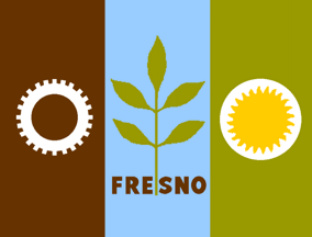
I think some of the most interesting city flags are the ones with designs obviously rooted in the 1960s or 1970s but that manage to be pretty classy anyway. Portland, Oregon, for example, has a mustard-accented yet sharp-looking flag from 1969. The guy who put together the flag of Des Moines, Iowa, in 1974 very cannily abstracted a field-and-stripes design to refer to the city's bridges, which keeps the graphic sensibility a bit fresher. Compare these to, say, Fresno or Salem, Oregon, which I assume are from about the same era.
The flag of Burlington, VT, was designed by eighth graders in the early 1990s and serves no functional purpose. I imagine many of the less impressive city flags in the NAVA survey are similar throwaways, or outdated marketing items developed by the chamber of commerce, or something. I'm still having a hard time figuring out this flag from Provo, Utah, though. What does that symbolize, exactly? Tough on stains?
Anyway, that's enough excitement for one evening. Your call on whether city flags are more or less interesting than, say, state license plates.

3 Comments:
That's a pretty crummy flag, Milwaukee. To me its aesthetic falls somewhere in between low-fi cross-stitch and vintage edutainment-software splash screen. If I were them I'd set a one-year deadline to concoct a better flag and if that fails just use this instead.
I don't know what's up with Provo's flag either, but I feel vaguely compelled to ask my doctor if Provo is right for me.
I think also, tying in to Pittsburgh's' flag, one compliment I often here around the country about Pittsburgh is that our three professional sports teams share the same color schemes. I'm not sure which came first, the flag or the teams, but that is pretty cool that it goes all the way down.
The answer to all of the above is here.
That via Uni Watch.
Post a Comment
<< Home