Flow Chart
I feel like the most popular global warming worries tend to focus on spectacular disasters (sea level rise, hurricanes, catastrophic loss of adorable baby polar bears) and a little less on the unsexy matters of drought and agricultural failure. Consequently I'm less viscerally alarmed by Russia's rampaging wildfires than by the reports of their wheat harvest dropping by more than a quarter from last year. I don't know a lot about agriculture but I feel like (1) we probably can only take a limited amount of screwiness in our breadbaskets and (2) this is the sort of thing it's very hard to "adapt" to in the fuzzy way that climate optimists figure we will. I mean, I don't think this is the eco-apocalypse, but I think in a bunch of places it's going to look something like this.
(Weather blogger Jeff Masters notes that, so far in August, Moscow is averaging a whopping 27ºF hotter than average. Most of his post concerns the deadly monsoon rains hammering Pakistan, which he notes shuold be occurring with more frequency as temperatures continue to rise.)
Anyway, I mention this as a tangential lead-in to sharing this rather excellent diagram of U.S. energy use, which I saw on some blog or other several weeks ago. (Today I'm pulling it from here; this was posted in 2007.) I'd rather think about elegant illustrations of data than the problems those data incur in real life. And I think it's eye-opening, too! (At least if you see it a bit larger than Blogger permits. Click for bigger.)

On your left are the energy sources, on the right the categories of how it's used. A couple of takeaways:
So there's your day's reading on innovative graphical presentation of data. You're welcome!
(Weather blogger Jeff Masters notes that, so far in August, Moscow is averaging a whopping 27ºF hotter than average. Most of his post concerns the deadly monsoon rains hammering Pakistan, which he notes shuold be occurring with more frequency as temperatures continue to rise.)
Anyway, I mention this as a tangential lead-in to sharing this rather excellent diagram of U.S. energy use, which I saw on some blog or other several weeks ago. (Today I'm pulling it from here; this was posted in 2007.) I'd rather think about elegant illustrations of data than the problems those data incur in real life. And I think it's eye-opening, too! (At least if you see it a bit larger than Blogger permits. Click for bigger.)

On your left are the energy sources, on the right the categories of how it's used. A couple of takeaways:
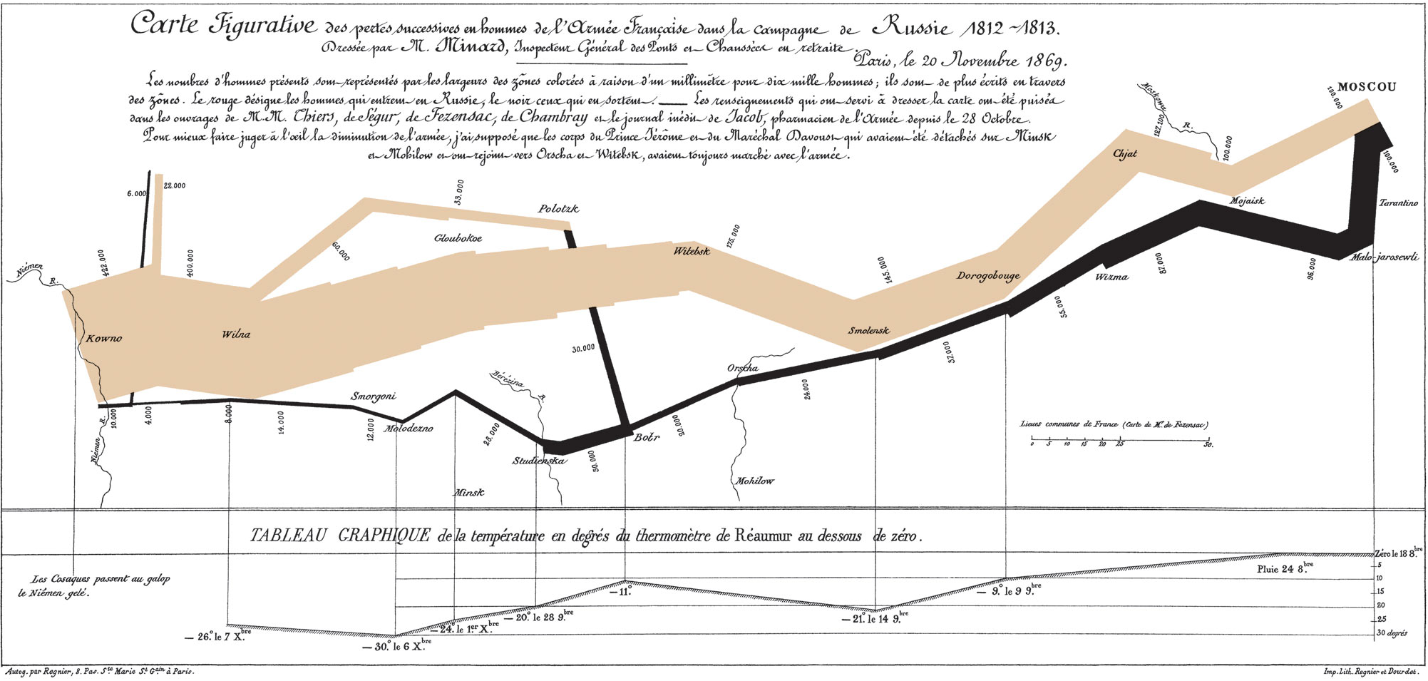
1. Note exactly how tiny the non-fossil-fuel sources are in proportion, and how we're not exactly around the corner from scaling them up to meet our needs.This style of chart is called a Sankey Diagram, and you can find a whole blog devoted to them. The namesake was an Irish engineer named Matthew H. Sankey. Most frequently the diagrams seem to be applied to illustrating energy use. (There's a particularly sweet one here.) The seasoned nerd will note a family resemblance to the famous Napoleon-in-Russia map of Charles Joseph Minard. (Minard, in fact, made a number of maps in this genre -- search the Minard tag on this blog.) The Minard maps predate Sankey by a handful of decades. One of the more interesting items coming out of the local ivy-league book factory, actually, is a Minardesque compilation of maps relating to the African slave trade, which shows that the idea has staying power.
2. Those big gray flows are lost or wasted energy. Note especially how inefficient electricity generation is.
So there's your day's reading on innovative graphical presentation of data. You're welcome!

1 Comments:
Wheat harvest is dropped? Nyet! Grain production for period 2009-2010 is five times on track for quota amount! All glory to Great Gardener Stalin!!
Oh, wait, fall of communism... Yeah, breadbasket in trouble. I think the Sankey Diagrams are neat, too, especially the ones on the blog that don't indicate in any way the futility of the human enterprise.
Post a Comment
<< Home