The Awesome and Vibratory Power of Color
Three days to football season! Dude, let's talk about interior design.
I've mostly finished cleaning up my room now, and it's nice to see it with the furniture basically in the right place. And with the boxes all moved out from the middle of the room, and without clothes strewn everywhere. Of course, it now appears vast and very bland: I will need some kind of area rug, and plants, and I think I do need to paint at least a couple of these walls.
The question is, What Color? And even though the answer iwill inevitably be Beige, I thought I would conduct some online research about environmental color influences on affect.
Conducting online research about environmental color influences on affect, by which I mean googling "room color effect on mood" and skimming the first two pages of links, steers you towards more of a home-design-related body of knowledge than a cognitive-science-related body of knowledge. This is fine, since it's relevant, and you get a good sense of conventional wisdom backed up with softly phrased pseudoscience.
Better Homes and Gardens has the richest vein of info, and their gently undulating writing style is surprisingly soothing. True fact: color works magic by communicating with our emotions!

They also introduce the color wheel, which offers the one suggestion you'd expect a color wheel to provide you. Thanks for the tip, little guy!
The most enlightening bit of info from BHG is that "warm colors advance," and "cool colors recede." This makes me feel kind of paranoid, unfortunately; I don't want my colors going anywhere. Do they advance when your back is turned to them? If you stare at them hard enough, will they stop?
Of the off-whites of my destiny: "They neither activate nor pacify; they blend, combine, and cooperate." That sounds about right. Notice how the use of transitive verbs without objects lends a creamy neutrality to the language: well done.
HomeTonic.com reiterates mostly the same information but adds the baffling tip, "Be careful not to overdo and paint everything standing still." I want to know what they think the less desirable alternative is.
Homier advice from The Budget Decorator suggests taking inspiration from nature, where "God has created some of the most beautiful colors!" I'm not sure I like this turn of phrase: shouldn't God have created either all of the beautiful colors, or else none of them?
If there are, in fact, beautiful colors that God has not created, you should probably just avoid using them anyway: I haven't read the Old Testament in a while, but that sort of thing usually seems to end badly.
By far the most helpful tip is from MsFinancialSavvy.com, though a broken link unfortunately limits her wisdom to the color red:
Most of the rest of that website is devoted to financial advice, which you might want to take with a grain of salt.
So yeah: I'm thinking Beige. Applying any more interesting color is much more likely to go horribly wrong, leaving my place of rest, renewal, and emotional growth looking depressingly like some kind of elementary school classroom.
I've mostly finished cleaning up my room now, and it's nice to see it with the furniture basically in the right place. And with the boxes all moved out from the middle of the room, and without clothes strewn everywhere. Of course, it now appears vast and very bland: I will need some kind of area rug, and plants, and I think I do need to paint at least a couple of these walls.
The question is, What Color? And even though the answer iwill inevitably be Beige, I thought I would conduct some online research about environmental color influences on affect.
Conducting online research about environmental color influences on affect, by which I mean googling "room color effect on mood" and skimming the first two pages of links, steers you towards more of a home-design-related body of knowledge than a cognitive-science-related body of knowledge. This is fine, since it's relevant, and you get a good sense of conventional wisdom backed up with softly phrased pseudoscience.
Better Homes and Gardens has the richest vein of info, and their gently undulating writing style is surprisingly soothing. True fact: color works magic by communicating with our emotions!
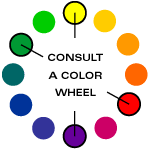
They also introduce the color wheel, which offers the one suggestion you'd expect a color wheel to provide you. Thanks for the tip, little guy!
The most enlightening bit of info from BHG is that "warm colors advance," and "cool colors recede." This makes me feel kind of paranoid, unfortunately; I don't want my colors going anywhere. Do they advance when your back is turned to them? If you stare at them hard enough, will they stop?
Of the off-whites of my destiny: "They neither activate nor pacify; they blend, combine, and cooperate." That sounds about right. Notice how the use of transitive verbs without objects lends a creamy neutrality to the language: well done.
HomeTonic.com reiterates mostly the same information but adds the baffling tip, "Be careful not to overdo and paint everything standing still." I want to know what they think the less desirable alternative is.
Homier advice from The Budget Decorator suggests taking inspiration from nature, where "God has created some of the most beautiful colors!" I'm not sure I like this turn of phrase: shouldn't God have created either all of the beautiful colors, or else none of them?
If there are, in fact, beautiful colors that God has not created, you should probably just avoid using them anyway: I haven't read the Old Testament in a while, but that sort of thing usually seems to end badly.
By far the most helpful tip is from MsFinancialSavvy.com, though a broken link unfortunately limits her wisdom to the color red:
RED: is the color of energy, vitality and power. It is used for burning out cancer, drying up weeping sores or wounds, etc., it will warm cold areas to reduce pain. . . . Red is not to be used on people with high blood pressure or anxiety. If you stay under the red ray too long or are exposed to red for a considerable time it will make you very agitated or even aggressive.You heard it here first: think twice before installing the Red Ray in a bedroom or den. Consider one instead over the dining table, where it will promote appetite and sexual passion. IMPORTANT NOTE: MAKE SURE RED RAY IS SET TO "LOW" BEFORE DOMESTIC USE OF ANY KIND.
Most of the rest of that website is devoted to financial advice, which you might want to take with a grain of salt.
So yeah: I'm thinking Beige. Applying any more interesting color is much more likely to go horribly wrong, leaving my place of rest, renewal, and emotional growth looking depressingly like some kind of elementary school classroom.

0 Comments:
Post a Comment
<< Home